How to Use Colour Contrast in Aquascaping for Maximum Impact
Colour is one of the most powerful tools in aquascaping, yet many hobbyists default to all-green layouts that, while beautiful, miss opportunities for dramatic impact. Understanding how to use colour contrast in aquascaping can elevate your tank from attractive to unforgettable. This guide from Gensou Aquascaping at 5 Everton Park explores colour theory as it applies to underwater design.
Basic Colour Theory for Aquascaping
The colour wheel is your friend. Complementary colours sit opposite each other — green and red, blue and orange, yellow and purple. Placing complementary colours next to each other creates maximum visual tension and impact. In aquascaping, the most common application is red plants against green plants — the red pops dramatically because it contrasts with the dominant green of the layout.
Green on Green: Shade Contrast
Even in an all-green aquascape, colour contrast is possible through different shades of green. Light lime green (Micranthemum Monte Carlo) against dark forest green (Bucephalandra) creates depth and visual interest. Place lighter greens in areas you want to advance visually (they appear closer) and darker greens where you want recession (they appear farther away). This technique adds three-dimensionality without any non-green plants.
Red as a Focal Point
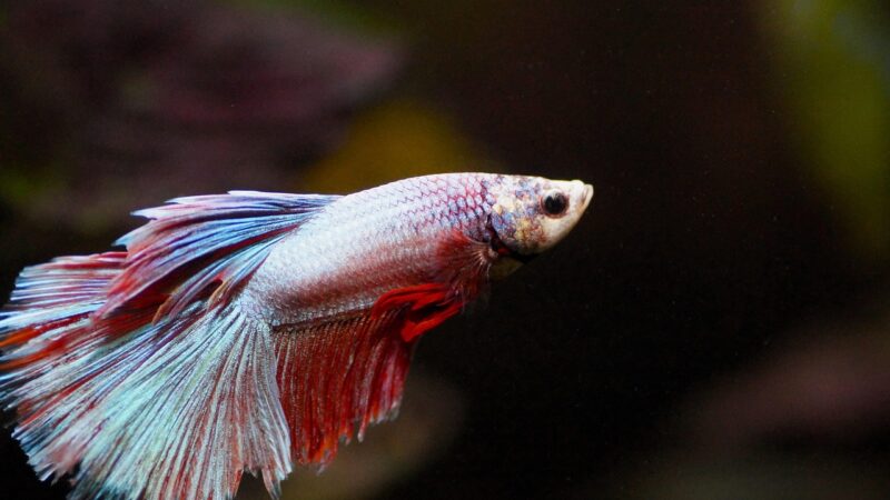
A single cluster of red plants in a predominantly green aquascape draws the eye like a beacon. Use this strategically — place red at your intended focal point, following the rule of thirds. Effective red plants include Rotala H’Ra, Ludwigia Super Red, Alternanthera Reineckii Mini and Red Tiger Lotus. Keep the red area compact and intentional rather than scattered throughout the layout. Too much red dilutes its impact.
Brown and Warm Tones
Brown and bronze tones from Cryptocoryne wendtii ‘Brown’, Nymphaea zenkeri and certain Bucephalandra varieties add warmth and earthiness. These warm tones complement cool greens and create a more natural, forest-like palette. Place warm-toned plants near driftwood of a similar colour to create visual harmony between hardscape and planting.
Hardscape Colour Choices
The colour of your rocks and wood affects the entire composition. Grey Seiryu stone provides cool contrast against warm green plants. Golden Dragon stone adds warmth and pairs well with brown-toned plants. Dark driftwood creates strong contrast with bright green plants but can make red plants less visible. Light-coloured Manzanita wood adds brightness and pairs well with darker plant species. Choose hardscape colours that complement, not match, your plant palette.
Substrate Colour Impact
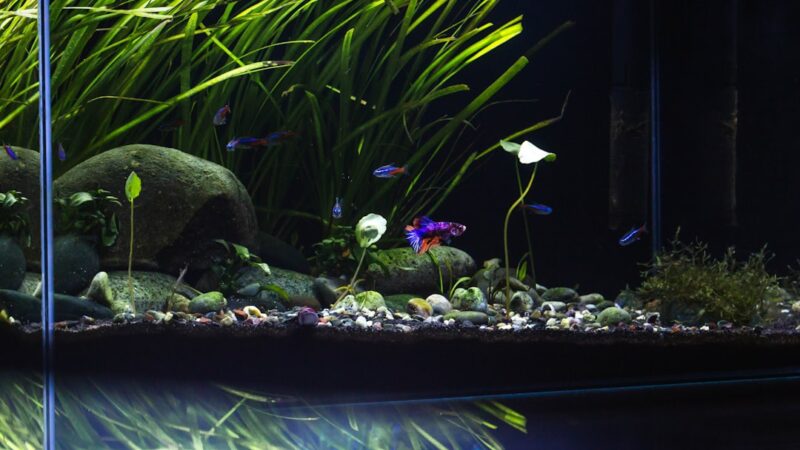
Dark substrate (black aqua soil, dark sand) makes green plants appear more vivid and creates a sense of depth. White or light sand brightens the layout and creates a clean, modern feel but can make green plants look less intense. A dark background with dark substrate produces the most dramatic colour contrasts — plants and fish appear to glow against the darkness.
Using Fish as Colour Accents
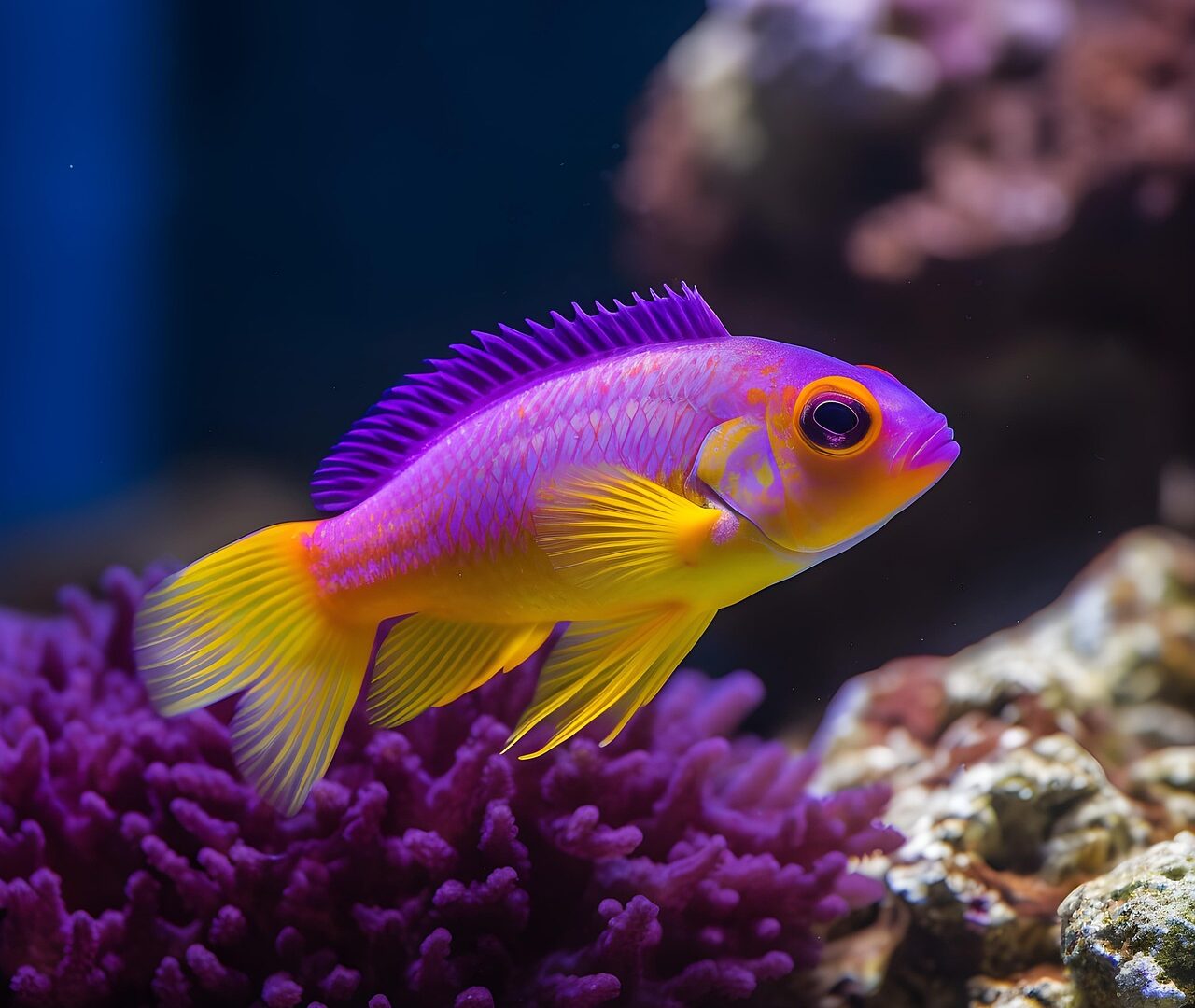
Fish are living colour elements in your aquascape. A school of cardinal tetras adds a blue-and-red accent line that contrasts with green plants. Ember tetras provide warm orange against cool greens. A betta’s intense blue or red becomes the centrepiece. Choose fish colours that complement your plant palette — red fish in a green layout create complementary contrast, while blue fish in a green layout create analogous harmony.
Common Colour Mistakes
Too many colours: More than three dominant colours creates visual chaos. Stick to a primary colour (green), a secondary accent (red or brown) and a neutral (hardscape colour).
Even distribution: Spreading colour evenly across the layout eliminates contrast. Concentrate accent colours in one or two areas for maximum impact.
Ignoring lighting colour temperature: Warm white LEDs (3000K) make reds and browns look richer but can make greens look yellowish. Cool white (6500–8000K) makes greens vibrant but can wash out reds. Many aquascapers use full-spectrum RGB LEDs to fine-tune the colour rendering of their layout.
Forgetting the background: A black background maximises colour contrast. A blue background adds cool tones. A white background reduces contrast and can make colours look flat. Choose a background colour that supports your overall palette.