Colour Theory in Aquascaping: Using Contrast and Harmony in Plant Selection
Green dominates the planted aquarium, but it does not have to define it. Skilled aquascapers use reds, purples, browns and yellows to create visual tension, draw the eye and establish mood — all guided by principles that painters and designers have relied on for centuries. Understanding colour theory aquascaping transforms plant selection from an afterthought into a deliberate artistic choice. At Gensou Aquascaping, 5 Everton Park, Singapore, we have spent over 20 years refining planted layouts where colour placement is every bit as intentional as hardscape positioning.
The Colour Wheel in Your Tank
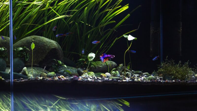
Colour theory starts with the colour wheel. Green sits opposite red, making them complementary colours — placed side by side, they intensify each other dramatically. This is why a cluster of Alternanthera reineckii ‘Mini’ glows so powerfully against a backdrop of bright green Rotala rotundifolia ‘Green’. Analogous colours sit adjacent on the wheel and create harmony rather than tension: yellow-green Pogostemon erectus beside mid-green Hygrophila pinnatifida produces a calm, unified appearance. Neither approach is inherently better. The choice depends on the mood you want to create.
Working With Red Plants
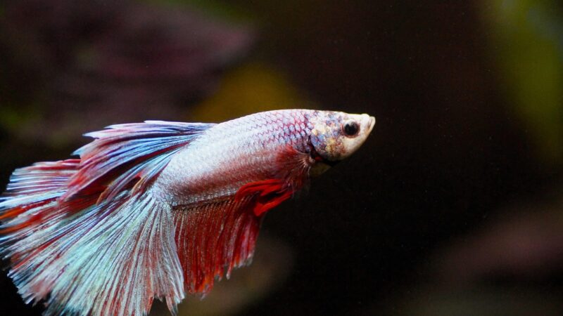
Red is the most powerful accent colour in aquascaping. It naturally draws the eye, making red plants ideal for focal points. Species like Rotala macrandra, Ludwigia palustris ‘Super Red’ and Alternanthera reineckii range from deep burgundy to vivid crimson depending on light intensity and nutrient balance. High light (above 80 PAR) and adequate iron dosing are essential for strong red colouration — underpowered lighting turns reds muddy brown. In Singapore’s planted tank scene, iron supplementation at 0.1-0.2 ppm keeps red plants vivid. CO2 injection at 25-30 ppm further intensifies coloration by enabling robust growth under high light.
Using Contrast Strategically
Contrast creates visual interest and prevents the “wall of green” problem that plagues many planted tanks. The strongest contrast pairs complementary colours: red against green, orange against blue-green. Place high-contrast elements at your intended focal point, typically the golden ratio intersection (roughly one-third from either side of the tank). Lower-contrast, analogous colour groupings work best in supporting areas where you want the eye to rest rather than fixate. A tank with contrast everywhere has no focal point; a tank with none feels flat and lifeless. Balance is the objective.
Warm and Cool Colour Temperature
Warm colours (red, orange, yellow) advance visually — they appear closer to the viewer. Cool colours (blue-green, dark green) recede, appearing farther away. Aquascapers exploit this perceptual effect to enhance depth. Plant warm-toned species like Rotala ‘H’ra’ or Ludwigia repens in the foreground and midground, while cooler, darker greens like Bucephalandra or Bolbitis heudelotii populate the background. The result is a subtle but effective amplification of the front-to-back distance, complementing physical depth techniques like substrate sloping.
Monochromatic Schemes
Not every striking aquascape needs red plants. Monochromatic designs use variations of a single hue — different shades and textures of green — to create sophisticated, restful compositions. The key is textural variety: fine-leaved Eleocharis acicularis carpets beneath broad-leaved Anubias barteri, with feathery Myriophyllum providing middle-ground softness. Light and dark green tones provide enough visual separation when leaf shapes and growth forms differ sufficiently. This approach is particularly effective in nature-style aquascapes where subtlety and naturalism take priority over drama.
Brown and Bronze Tones
Often overlooked, brown and bronze plants add warmth and naturalism. Cryptocoryne wendtii ‘Brown’, bronze-leaved Cryptocoryne beckettii and the coppery tones of newly emerged Hygrophila pinnatifida provide earth tones that ground a layout visually. These mid-warmth colours bridge the gap between vivid greens and intense reds, preventing jarring transitions. In layouts featuring driftwood, bronze plants echo the wood’s colour, creating a cohesive palette that reads as unified rather than assembled from unrelated parts.
Lighting and Colour Perception
Your light fixture profoundly affects how plant colours are perceived. LEDs with a strong blue-to-green spectrum (6500-8000K) enhance green vibrancy but can wash out reds. Warmer white LEDs (4000-5000K) bring out reds and oranges but make greens appear yellowish. Full-spectrum fixtures with adjustable channels allow you to fine-tune the visual temperature of your aquascape. Many Singapore hobbyists run dual-channel LEDs, balancing cool white and warm white to achieve accurate colour representation across the full plant palette.
Practical Application
Start your colour plan before purchasing plants. Sketch the layout and assign colour zones — dominant green areas, accent red or brown areas, and transition zones using analogous shades. Limit your palette to two or three colour groups per layout. More than that risks visual chaos. Visit local shops along Serangoon North or browse Carousell listings to source specific varieties, as plant availability in Singapore varies seasonally. With intentional colour placement, even a simple 60 cm tank can achieve the visual sophistication of competition-level aquascapes.
Related Reading
- How to Use Colour Contrast in Aquascaping for Maximum Impact
- Colour Temperature and Lighting in Aquascaping: Kelvin, CRI and Mood
- Deepavali Themed Aquascape: Festival of Lights in Your Tank
- 3D Printed Aquarium Accessories: Practical DIY Projects for Fishkeepers
- Advanced Aquascape Depth: Layered Substrate and Elevation Tricks
emilynakatani
Still Have Questions About Your Tank?
Drop by Gensou Aquascaping — most walk-in questions get answered in under 10 minutes by someone who has set up hundreds of tanks.
5 Everton Park #01-34B, Singapore 080005 · Open daily 11am – 8pm